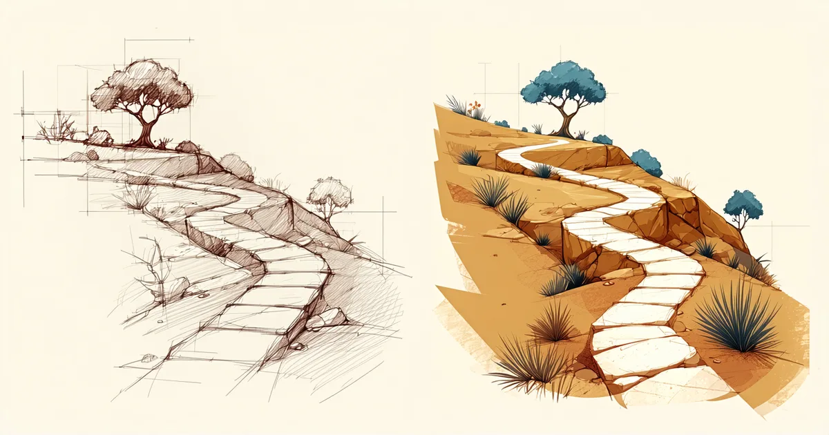
The first sketch of Camins was made on paper at a café on the Rambla del Poblenou — a rough grid drawing of a landscape with lines that might become paths. I do not remember exactly what I was trying to work out. I remember that the idea was about orientation rather than navigation: not "how do I get there" but "where was I, and where could I have gone."
That distinction — orientation versus navigation — ended up being one of the central design principles of the game. This is the full development story, from that sketch to the day we uploaded the build to itch.io.
The Concept Phase: What Kind of Puzzle Is This?
The early months of Camins were spent trying to answer a question that sounds simple but is not: what kind of puzzle is this, exactly?
Path-tracing puzzles are a genre with a history. The most well-known is probably the Witness-style line puzzle — the player draws a path through a grid, following constraints that are progressively revealed. There are also flow-style puzzles (connecting colored nodes with non-crossing paths), maze-style puzzles (navigating from entrance to exit), and exploration puzzles (discovering the terrain rather than solving a pre-defined route).
Camins is closest to exploration — but with a puzzle structure underneath it. The player is not solving a maze (there is no single correct path). They are uncovering the landscape, finding which connections between points are possible, and building a picture of the terrain through exploration. The puzzle element is discovering what the landscape's rule system permits, not executing a pre-defined solution.
This sounds like a small distinction, but it had large design consequences. Exploration-first puzzles have different feedback requirements from solution-first puzzles. The player is not evaluating progress toward a known endpoint; they are forming and testing hypotheses about an unknown space. The game needs to reward curiosity — every path explored should feel like it has revealed something — rather than rewarding correctness.
The Accessibility Architecture, Built In From Week One
Before writing a line of game code, I wrote the Motor Commitment document I mentioned in the accessibility article. The commitment had four items at that point: full control remapping, no time limits, adjustable game speed, and generous interaction zones. Everything else in the accessibility stack built from those four foundations.
The most technically demanding commitment was the control remapping system. Full remapping in a game with mouse, keyboard, and gamepad support — where some actions are inherently mouse-native (path drawing) and need to map sensibly to keyboard and gamepad equivalents — requires a well-defined input abstraction layer. The game responds to abstract input events (move cursor up, extend path, undo, pause) rather than specific hardware inputs, and the mapping between hardware and abstract events is configurable.
Getting this right took about three weeks at the start of development. It was slow, unglamorous work — defining the event schema, building the remapping persistence, testing edge cases (what happens when two actions are mapped to the same key? what happens when a player maps a modifier key as a main action?). But doing it first meant that every subsequent gameplay feature was built against the abstraction layer, and adding new actions automatically inherited remappability. Retrofitting this architecture after the fact would have taken significantly longer.
Visual Language: The Mediterranean Grid
Camins's visual language was developed in parallel with the puzzle architecture, and it took longer to find than the mechanics did.
The early prototype was a gray grid with white lines. Functional, but completely disconnected from the game's sense of place. The design intention from the start was a Mediterranean landscape — Catalonian terrain, warm light, the particular quality of sun on stone — and arriving at that in a stylized form that worked as a puzzle interface required more iteration than I expected.
The challenge was that puzzle readability and visual richness are in tension. A highly detailed landscape illustration is beautiful but cluttered; the path system and interactive elements get lost in the visual noise. A clean, sparse grid is readable but cold. The solution we arrived at was layered: the game world has a painted-illustration feel but is compositionally simple — large areas of warm, relatively flat color with detail concentrated at the edges and in specific visual anchor points. The paths the player traces are drawn in a contrasting color (a saturated terracotta line against the warm stone) that reads clearly against the background at all zoom levels.
The high contrast mode variant of this palette took about two additional weeks. Designing two simultaneously functional palettes — one warm and illustrative, one stark and high-contrast — required that the color coding of the game's interactive elements was consistent in both: the path color is always the standout element against its background, whatever the background is.
The Puzzle Design Process
Camins launched with fourteen puzzles. Designing those fourteen puzzles required sketching, playtesting, and discarding approximately forty. This ratio — three designed for every one shipped — is not unusual for puzzle games, but it was higher than I expected when we started.
The discards fell into a few categories. The largest was puzzles that were technically correct — valid, solvable, rule-consistent — but not interesting. A puzzle that has a solution and reveals nothing about the landscape's logic on the way to finding it is not a good Camins puzzle. We looked for puzzles where the process of exploration produced a small understanding — a moment of "oh, the system works like this" — even if the player did not complete the puzzle on that attempt.
The second discard category was puzzles that worked well for experienced players but produced cognitive overload for players encountering the mechanic for the first time. These puzzles were sound in the abstract but were in the wrong position in the sequence. Some of them survived as later puzzles; others were simplified or cut.
The third category was puzzles that relied on the player remembering information from a previous puzzle. We cut all of these when we realized they contradicted the design principle of state externalization — the player should never need to recall something from a previous session to make progress in the current one.
Audio Design: The Landscape Has a Voice
The audio in Camins was designed by a freelance sound designer we work with in Barcelona's 22@ creative community. The brief was specific: the landscape should have an ambient voice that responds to the player's position and progress, reinforcing the puzzle state information through audio without replacing the visual language.
The result is a procedural audio layer built from a small palette of tonal elements — wind sounds that shift with terrain type, a low resonant tone that changes pitch as the player's explored path grows, a distinct sound for each of the game's interactive event types (path activation, undo, puzzle completion). The system is subtle enough that players who are not listening for it may not consciously notice it, but it adds a layer of feedback that several players with low vision identified as genuinely useful in post-launch feedback.
The Launch Week
Camins went live on itch.io on a Tuesday. The launch preparation had taken about three weeks: writing the game description (which went through four drafts), preparing the screenshot set, recording the short gameplay trailer, writing the full accessibility feature list for the itch.io page, and doing a final playthrough of every puzzle to check for regressions in the accessibility options.
The accessibility feature list on the itch.io page was something I felt strongly about. Many games list accessibility features tersely, if at all. We wrote a full description of each feature — what it does, what it is designed for, and how to enable it. The description of the high contrast mode specifies what changes and what stays the same. The control remapping description explains that every action is independently remappable and notes which actions have both keyboard and gamepad defaults. This is more writing than the typical itch.io page, but it is the information a player needs to know whether the game will work for them before they download it.
That principle — giving players the information they need to make a genuine choice — is, in the end, what accessibility design is about. Not boxes ticked. Not a feature list that looks good in a press release. A game that works for the people who want to play it, with enough honesty about what it does and does not offer that those people can make an informed decision.
Camins is the fullest expression of that principle we have built so far. The next one will be better.